Disney Plus
Disney Plus was a huge success in terms of sign-ups when it launched on Nov 12. In just 24 hours it amassed over 10 million subscribers, and over 3.2 million app downloads. Having now been a month since the launch, they’ve ironed out initial glitches and started adding features, like continue watching. Overall it feels simple and approachable. One area that still falls short is the navigation and way-finding experience. Inconsistency in patterns and some navigation oversight add friction to the experience, lowering quality, and would benefit from some additional consideration.
Navigation
The top level navigation menu is clear and simple, and the hover animation that mirrors the motion in the animated logo adds a nice touch. Still, there are two areas that seem overlooked. First, the misalignment of the labels with the rest of the elements in the top bar is a quick win that would make the nav feel more polished.

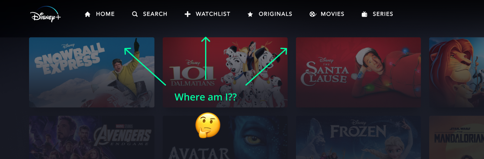
Second, and more importantly, there are no active states for the menu items. This makes it impossible to quickly scan the menu and identify where you are, forcing you to look at the content below. Inconsistency in page titles amplifies this problem, and although there aren’t a ton of items in the nav, adding an active state could really improve usability.
Page Titles
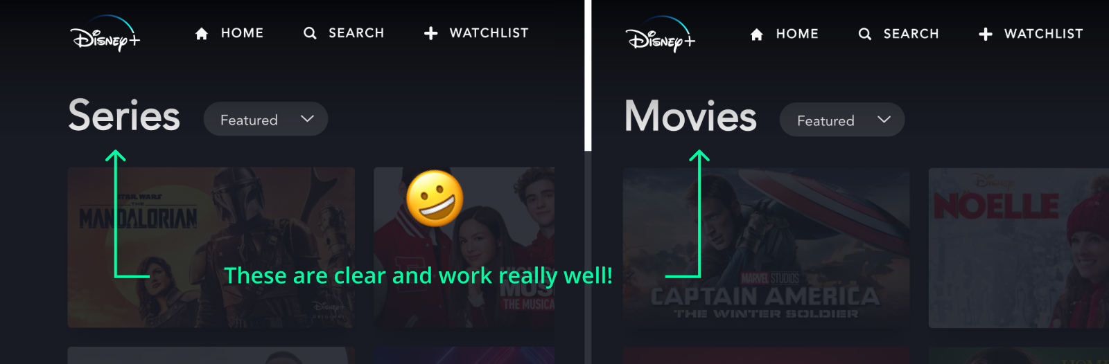
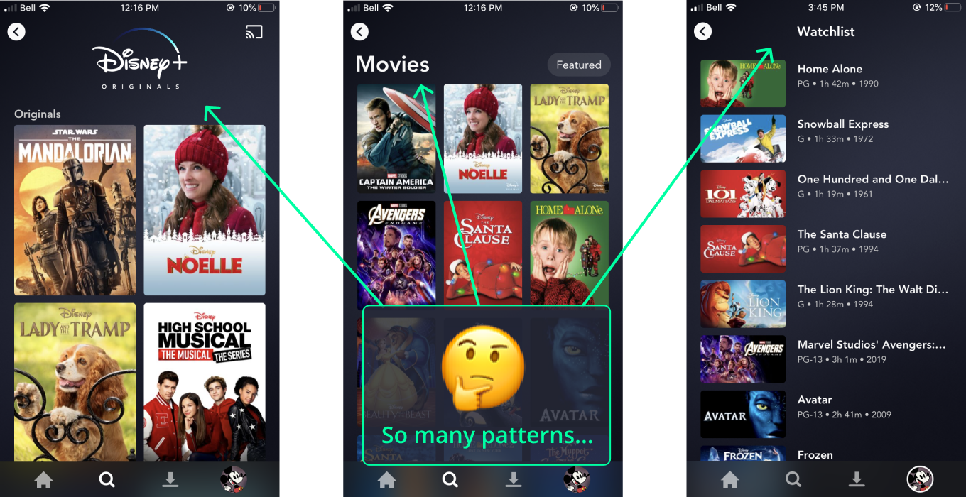
There are a few different title patterns used within the application. The large distinct titles on the Movies and Series pages work well and clearly communicate what page you’re on. Strangely 3 out of the 6 pages in the nav have their own pattern.
Home is where differentiation probably makes the most sense since it’s the most unique page, aimed to highlight content and help you pick up where you left off.
Search is also a bit unique given it has an oversized search bar across the top of the page. The title pattern is the same as Series and Movies, but once you search the title and content are replaced with your search results.
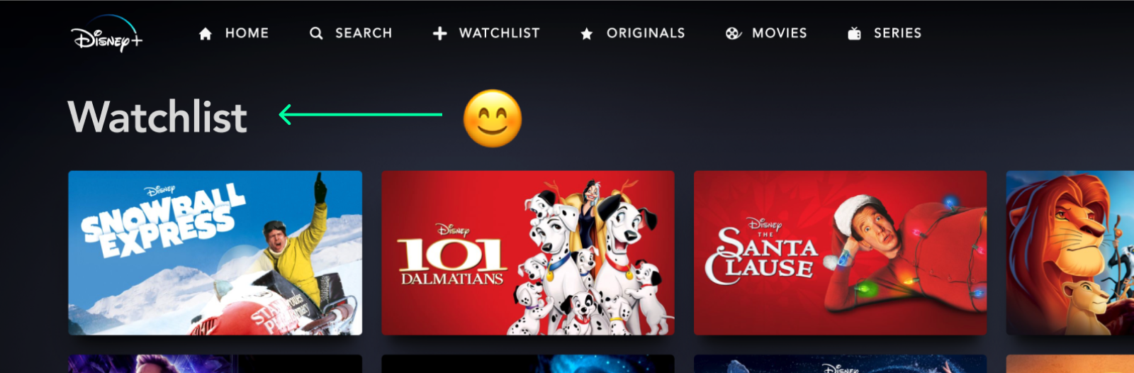
The Watchlist does not have a page title at all. This is especially problematic since the navigation doesn’t highlight the active page. Looking at the screenshot below as an example, the user really has no clue where they are. It makes this section feel forgotten with respect to the rest of the experience.
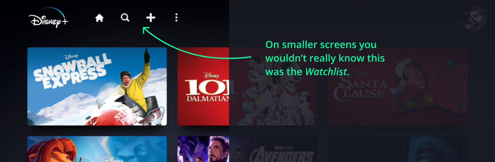
On smaller screens the labels are dropped from the nav altogether, and it’s condensed to 4 icons. Home, Search, Watchlist, and overflow. The lack of a page title means that on a smaller screen a user might never know this is the watchlist. It doesn’t seem to be referenced anywhere else in the product.
As an example, following the pattern that has already been established elsewhere (Movies/Series) would add clarity to this page, build on existing patterns reducing divergence, and increase consistency within the experience.
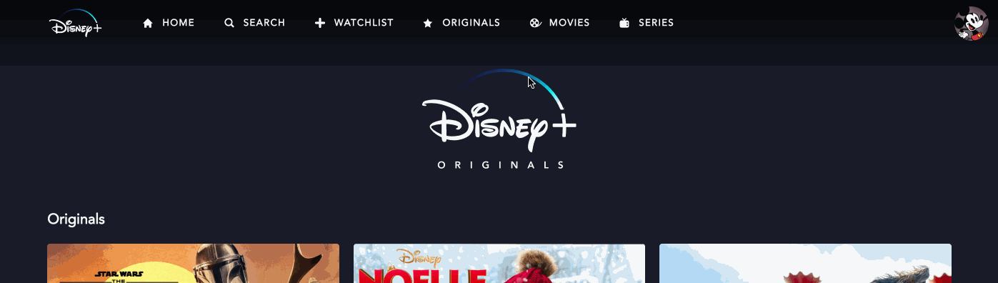
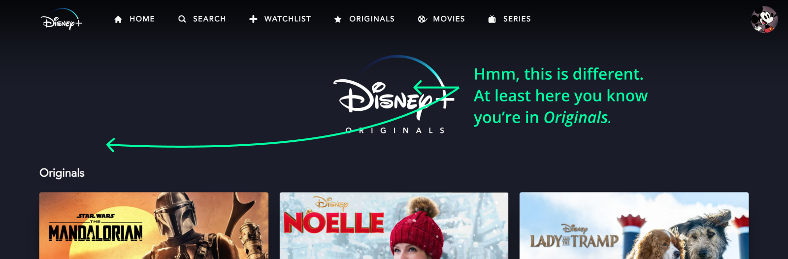
The Originals section also suffers from a rogue title pattern. Disney probably wanted to call out Originals in a special way, but I wonder if users really see the content on this page differently from content in the other sections. Especially since the content from Originals also shows up in the other categories. The animated logo on this page is very prominent and pushes down the content quite a bit, and just seems unnecessary. I’m going to advocate for consistency and make the argument that this page should also follow the same title pattern as the other pages.
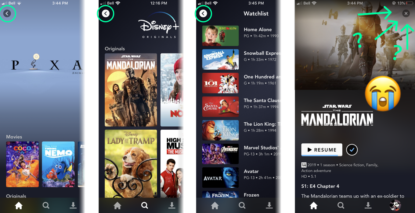
iOS - Navigation
A key difference in the nav items here is that the Watchlist has been replaced by Downloads. This probably makes sense given that users are more likely to download content for viewing offline on a portable device. Interestingly, the watchlist is really buried in the app, and is actually lumped in with profile related items.
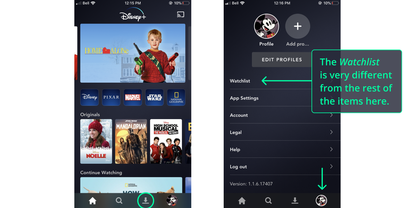
If you recall on the small desktop screen Watchlist was one of the key items that remained. This choice here is puzzling because I really think there is enough room in the tab bar here to include a 5th icon. This would keep the watchlist in the nav and maintain consistency with the web experience. It might even be worth exploring combining Watchlist and Downloads into one feature.
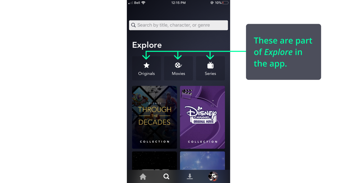
On the mobile app, Originals, Movies, and Series are content types within the search/explore page. This is a departure from the pattern on desktop but is a clever way to expose those categories within search/explore.
Page Titles
The page title patterns mostly translate over from the web version, and suffer from a similar lack of consistency. The Watchlist does have a title, but again uses a different pattern from some of the other sections in the app.
Return Actions
There is one page navigation pattern that creates significant friction. Throughout the app, the consistent way to “go back” is via a back arrow in the top left of the screen. Even when you’re viewing video content you get “back” by tapping an arrow in the top left.
The only place this pattern differs is on the content detail pages. Here the pattern is reversed and the user has to tap an x in the top right. The placement of this in the opposite corner is frustrating, and it’s hard to justify reasons for changing the pattern here. The x does essentially the same job as the back arrow on any of the other pages. Using the established back arrow pattern would eliminate this point of friction.
Disney Plus feels simple and approachable. The navigation experience does a good job of helping the user find and interact with the thing that matters most, the content. We’ll have to see how the product evolves as more content is added, and as competition from other streaming platforms intensifies.
Thanks for reading!