Duolingo
Duolingo is an amazing little app that helps you learn a new language with short, bite sized lessons you can do literally anywhere. The illustration style, clever copy, and fun UI make learning a new language enjoyable, and feel like something you can conquer. This app features refreshing visuals and interesting patterns, breaking the mold in a few areas. Here are some of my favourite details.
Emotion
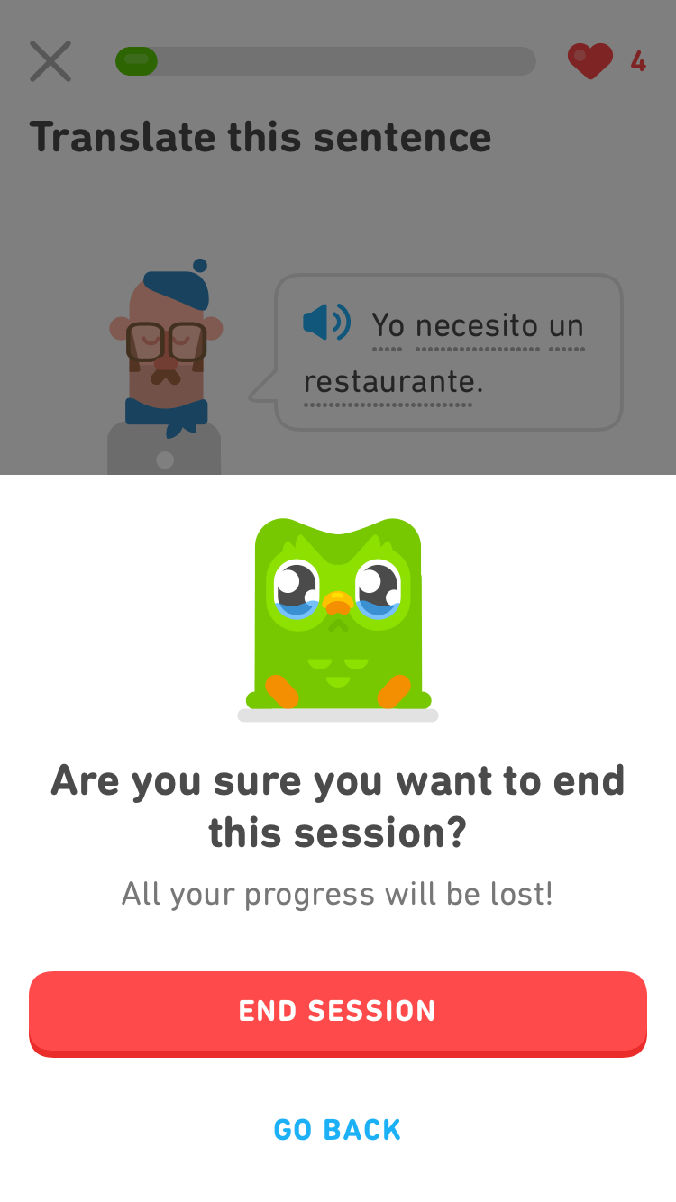
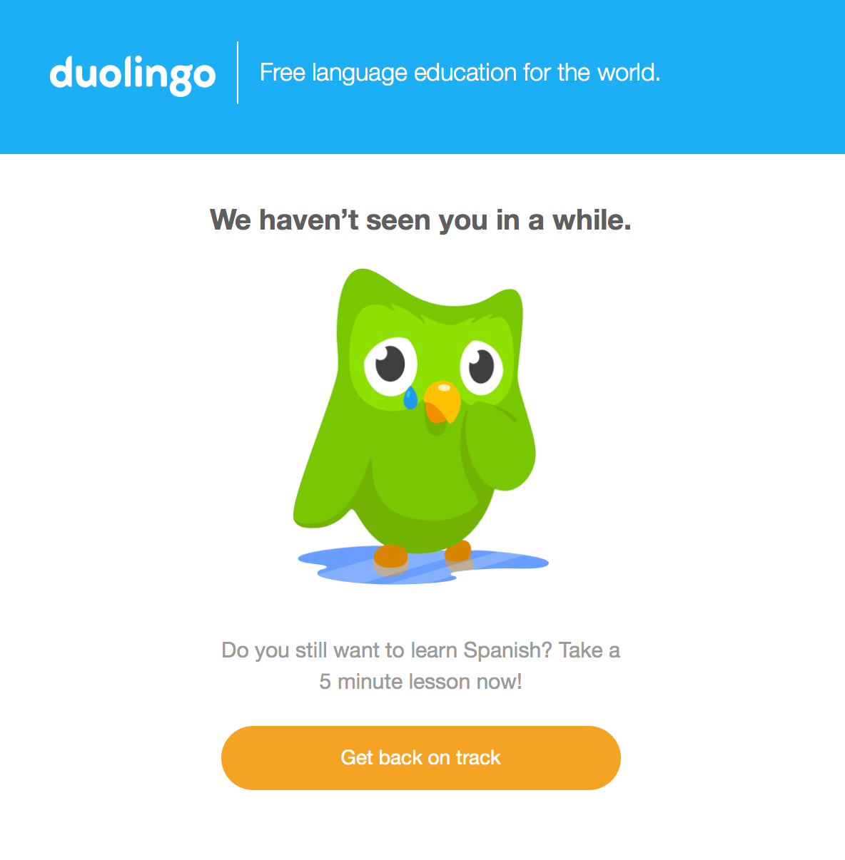
The designers did a great job of bringing emotion into the experience. From small things like getting a word right, to beating entire “levels”, the various characters cheer you on, celebrating each success, and cringing at each mistake. This adds a bit of personality to the app that makes you chuckle. Notifications and reminders can put you on a bit of a guilt trip, but this emotional connection is what I think makes Duolingo so special.
Animated Icons
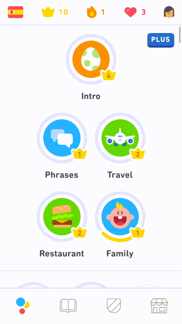
Once you’ve chosen a language to learn, you move through categories of words and phrases that increase in difficulty. Each of these has an icon to represent it. Tapping on the icon triggers a pop-over that summarizes your progress and lets you start the lesson. While in this focused state, each icon animates in different ways.
Reporting Issues
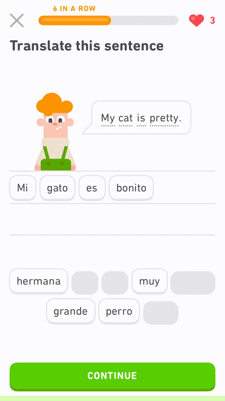
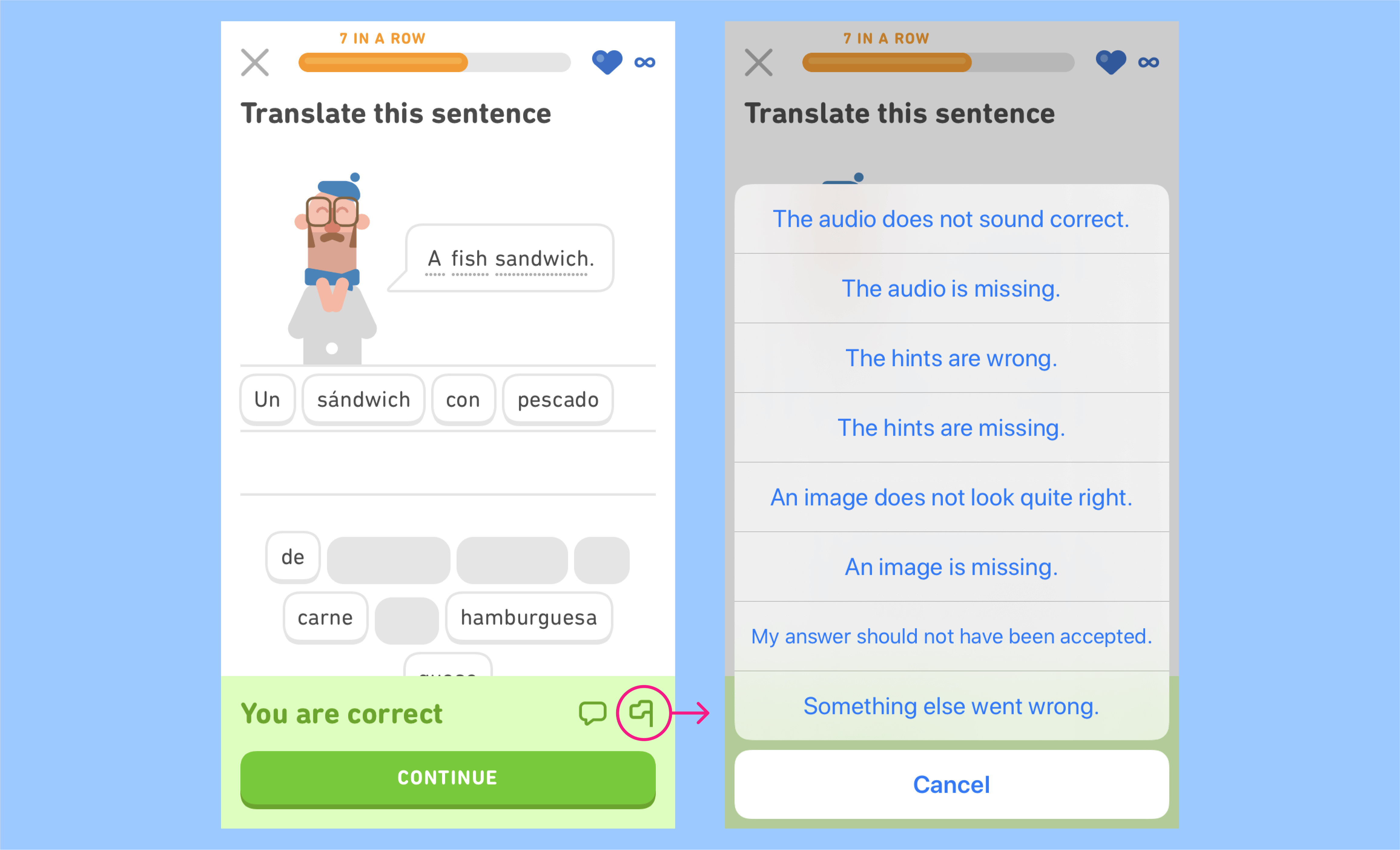
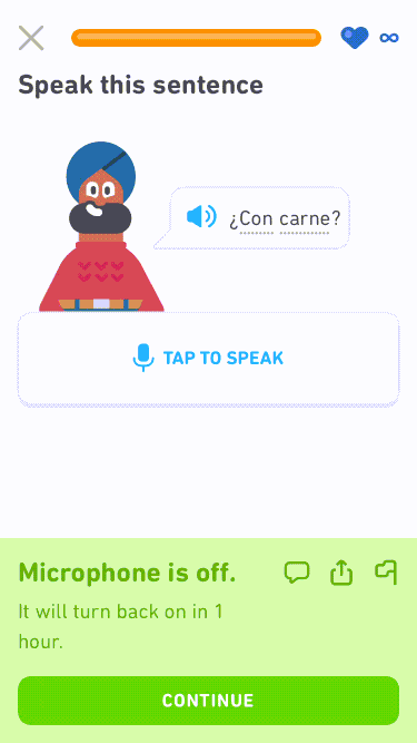
Lessons are a series of little exercises that teach and test your language skills. If any happen to encounter an error, there is a quick way to flag an issue without interrupting your flow through the lesson.
Hidden Duo
Pulling down to reveal something isn’t entirely novel, but it’s still nice to see from time to time. As you pull past the top of the page, Duo slides down to say hello. You can use gems that you earn by taking courses to change Duo’s outfit. The icing on the cake would be if this illustration reflected that.
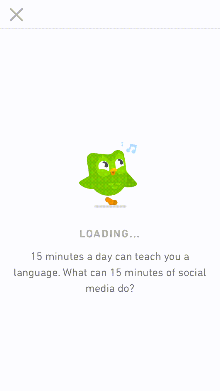
Loading States
I haven’t experienced many loading states in this app which is much appreciated. In times when a data fetch is required I find the loading state is well done and fits with the fun, lighthearted experience throughout the app. Aside from the animation, you get helpful tips for learning or interesting facts about Duolingo.
As with any product there are always things to improve, here are two that I think are worth a second look.
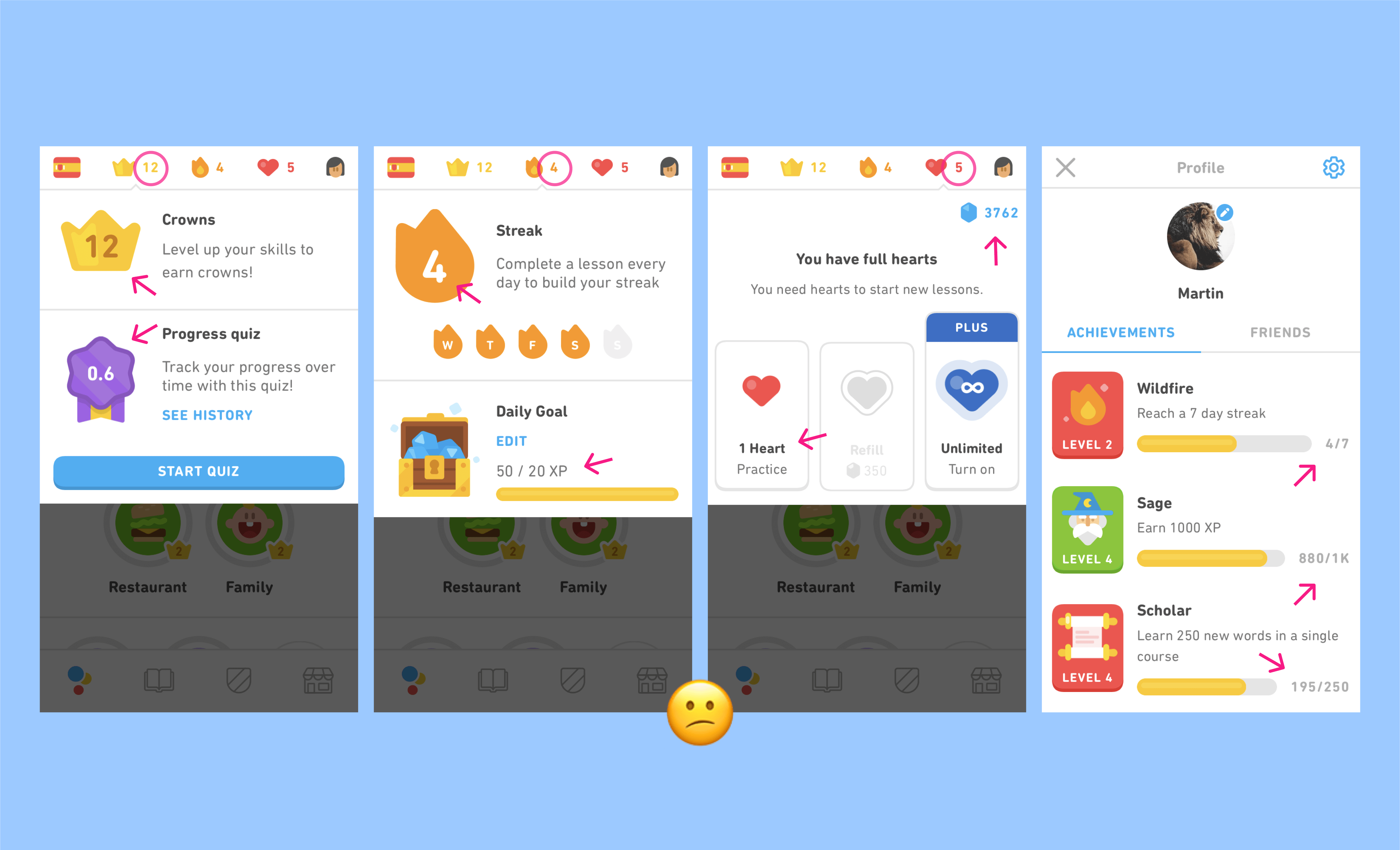
Info Overload
When you complete a lesson you get presented with multiple screens telling you all of the things you collected, XP earned, your level, info about the app, and sometimes an ad. It’s common to have to individually tap through 3-5 of these pages before getting back to the main screen. Aside from not being exactly sure what all these points are for, I feel these screens could be consolidated into one summarizing your progress.
Collectibles
Gamification is a big part of the experience. There are a few core items that help track your progress (crowns and streaks) and ways to keep “playing” (hearts). But aside from these there seem to just be so many other things to track and collect sprinkled throughout the app. To me the purpose of most of these isn’t clear, and feels a little bit like gamification overload. Perhaps there’s an opportunity to make the value of these clearer and/or consolidate some of them.
As always, thanks for reading. Adios amigos!