Peloton
The Peloton is a stunning product, and I was as interested in the experience of using the application as I was in the bike itself. Having now taken over 30 classes I can honestly say it does a fantastic job of combining the physical aspects of taking a spin class with data rich performance tracking we’ve come to expect from our connected devices, plus the added benefit of extreme convenience. The designers put a lot of thought into making the experience enjoyable, meaningful and social in a way that’s different from typical home gym equipment. In this post I’m going to focus on key aspects of the “in-class” experience, which for me it has fully replaced going to a studio.
Layout
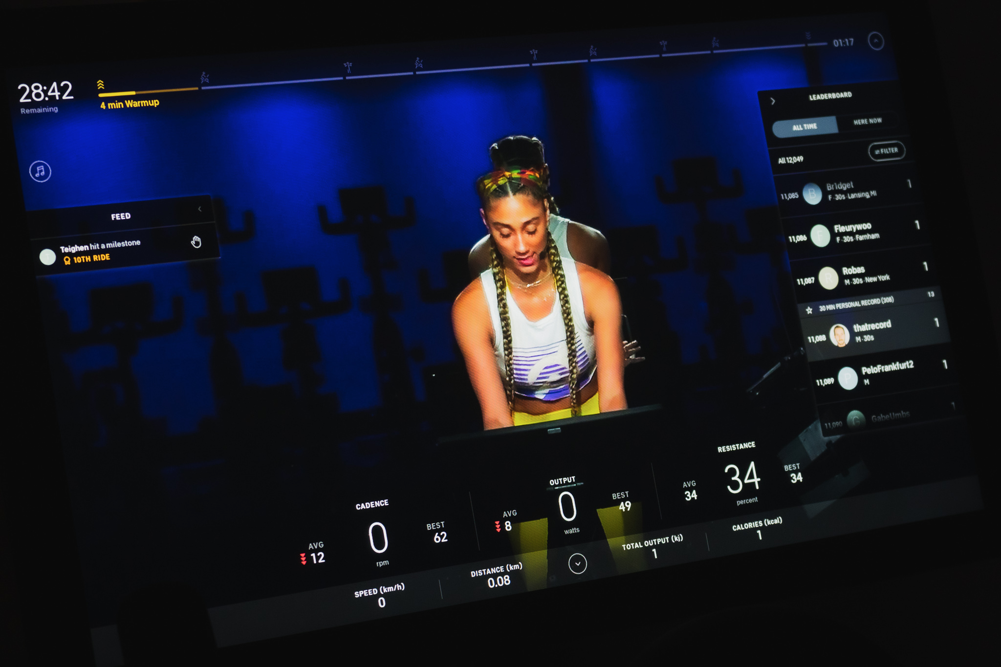
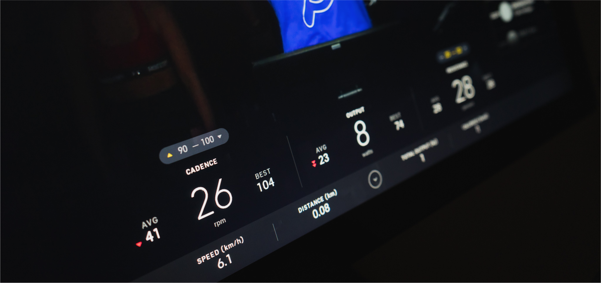
There are four distinct areas with the job of displaying information about the class, your metrics, and various social features. The interface feels light, and even with 6-7 components on screen by default it doesn’t feel overwhelming. The top area is dedicated to keeping track of time and class progress. Your performance metrics are displayed along the bottom in real-time as a series of stats like speed, output, resistance, cadence, etc. The responsiveness and accuracy of these really put your physical effort into perspective.
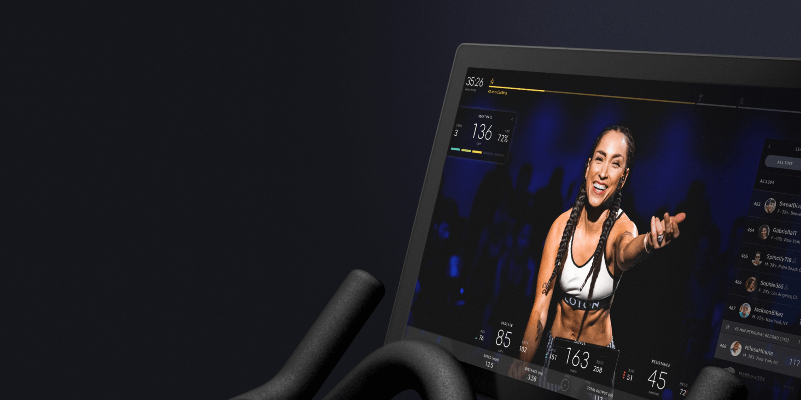
The right side is reserved for the leaderboard and scorecards, and the left contains your heart rate, the current song (which you can connect with Spotify), and your news feed. Overall this layout feels natural and makes good use of the horizontal orientation of the bike’s massive display.
Customization
You can hide components by tapping a small icon on or near each component, the placement isn’t entirely consistent. I find this works okay before you start exercising but is quite frustrating once you get going. After a few classes and a bit of tapping around I discovered you can also tap or swipe almost anywhere on any component to hide it. This is significantly easier than pinpointing tiny icons. A placeholder icon appears in place of the hidden component. You can swipe or tap anywhere in the empty zone to bring it back. The tap area for this interaction is nice and big making accuracy a non-issue.
There is also hidden gem that allows you hide all elements. Double tapping anywhere on the video hides all components. You can bring cards back into view individually or double tap again to bring them all back. This isn’t very discoverable but makes customization much easier. A future improvement could be to have the view persist so the user doesn’t have to fiddle with it in every class.
Progress
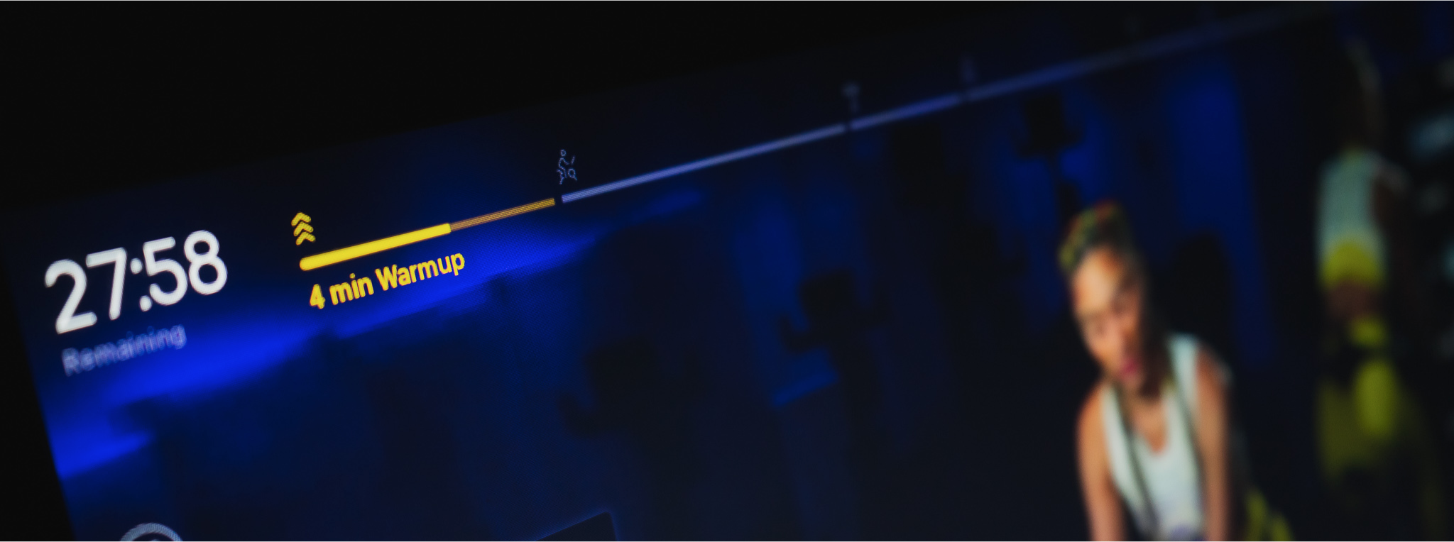
A bar across the top displays your progress through every class. One really neat feature of some classes is that they’re divided into distinct sections giving a glimpse of what’s coming up. I personally find I typically hide the bar to shift my focus away from how much time is left.
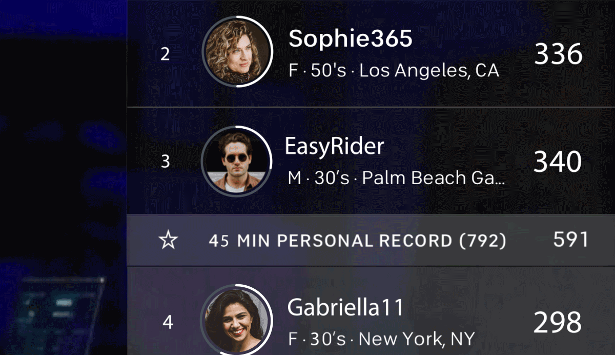
In pre-recorded classes users start at different times, so a user half way through will be much further ahead of someone who’s just started. Kudos to the designers for adding a completion ring to each user’s avatar in the leaderboard as a way to indicate progress. Interestingly hiding the progress bar at the top does not hide your completion ring in the leaderboard. If you really don’t want to focus on time remaining you also have to hide the leaderboard (pre-recorded classes only).
Guides
Some of the pre-recorded classes have these neat guides to help you stay in sync with the instructor. There is a subtle UI element that appears just above your real time metrics indicating the target range and up/down indicators that light up accordingly if you’re off track. I find this quite useful because it makes it a lot easier to stay in sync.
Leaderboard
The leaderboard has more interactive elements than any other component. I found the tap targets to be too small and frustrating to hit. Users are ranked by their real-time energy output, and your row displays current output and your record output for a class of the same duration. Tapping on someone’s avatar sends them a high-five, tapping their row pulls up a scorecard with their real time stats for the current ride. All of these small tap areas require you to be quite accurate which is especially difficult when you’re physically exercising.
High-fives
High-fives are Peloton’s way to bring social interaction to the classes with minimal user input. You can hi-five other users via the leaderboard or in response to a notification. In both places the tap targets just feel too small. I also find the animation lacks a level of delight that matches the rest of the Peloton experience. Given this is the only way to interact with other users during a ride there is a big opportunity to make these high-fives feel more celebratory.
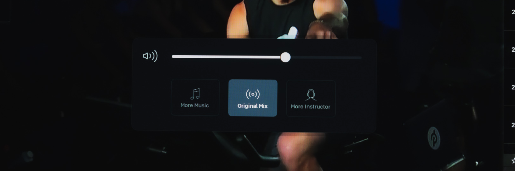
Audio
After a few classes I was glad to discover the physical volume buttons on the right side of the screen. Until this point I adjusted the volume from within the interface, which was a bit finicky with small tap targets here as well. Using the physical buttons reveals another clever feature where you’re able to change the audio output between more music, more instructor or the default. This is just a nice touch that allows you to further optimize your personal class experience.