Tempo
Tempo is an email client that helps you focus by letting you sort through email in batches rather than a constant stream of interruptions. This app is full of delightful animations and clever interactions that make it truly enjoyable to use. There are so many great things to cover you’ll have to try it out to experience them all, here are the ones I feel are worth calling out.
Workspace
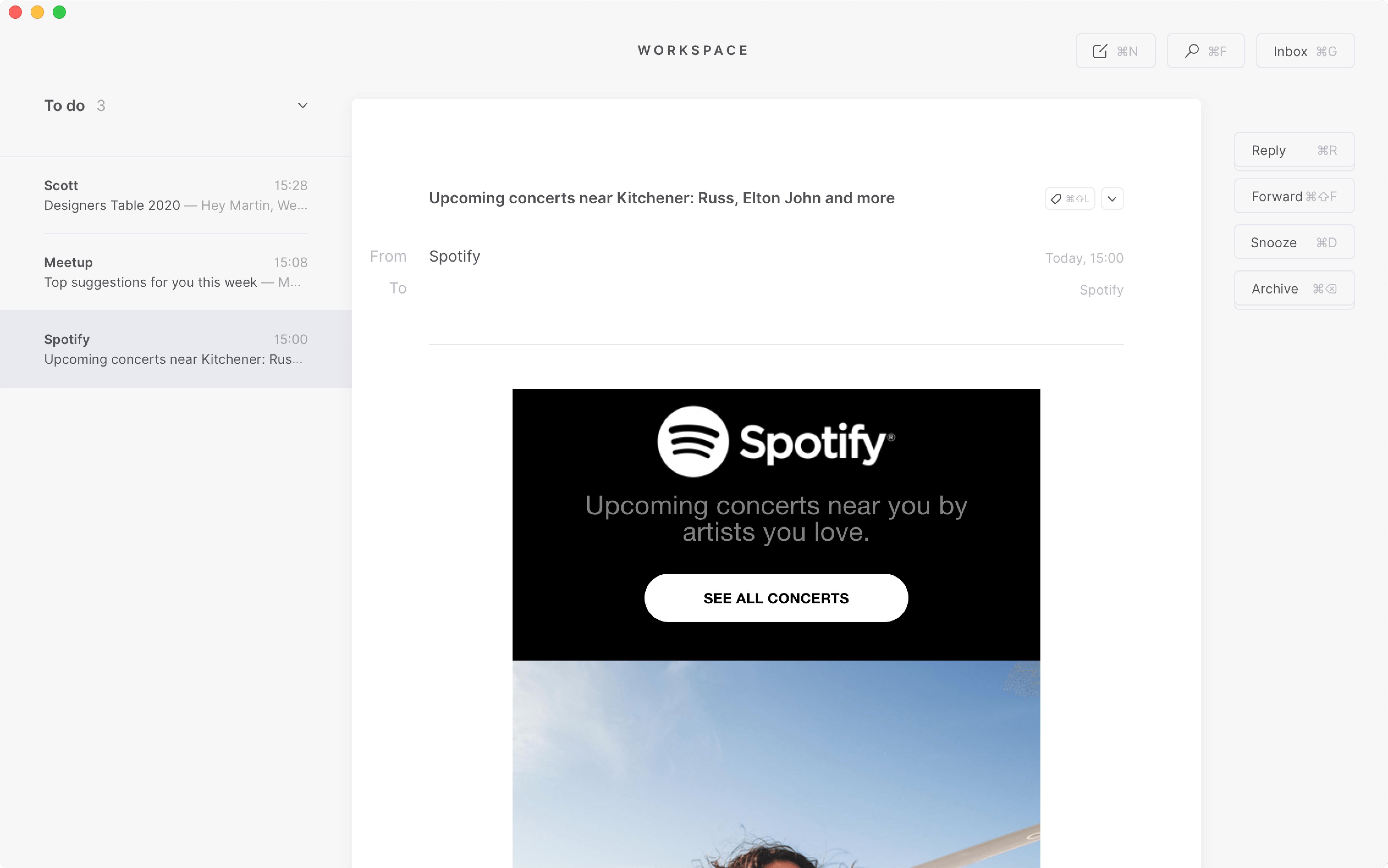
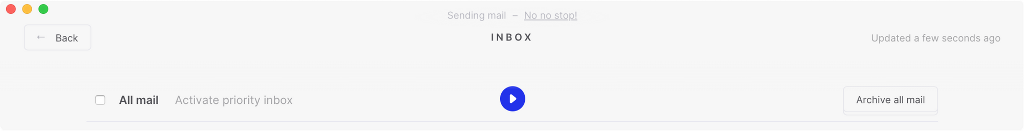
The workspace is your default landing page each time you launch Tempo. It’s where all of your important emails live until you action them in some way. Focusing on the most important items is a refreshing change-up from starting out in a typically cluttered inbox. However, I do admit it was hard for me to wait for a batch of emails before reviewing them in focus mode. I still found myself checking the inbox multiple times per day.
Focus Mode
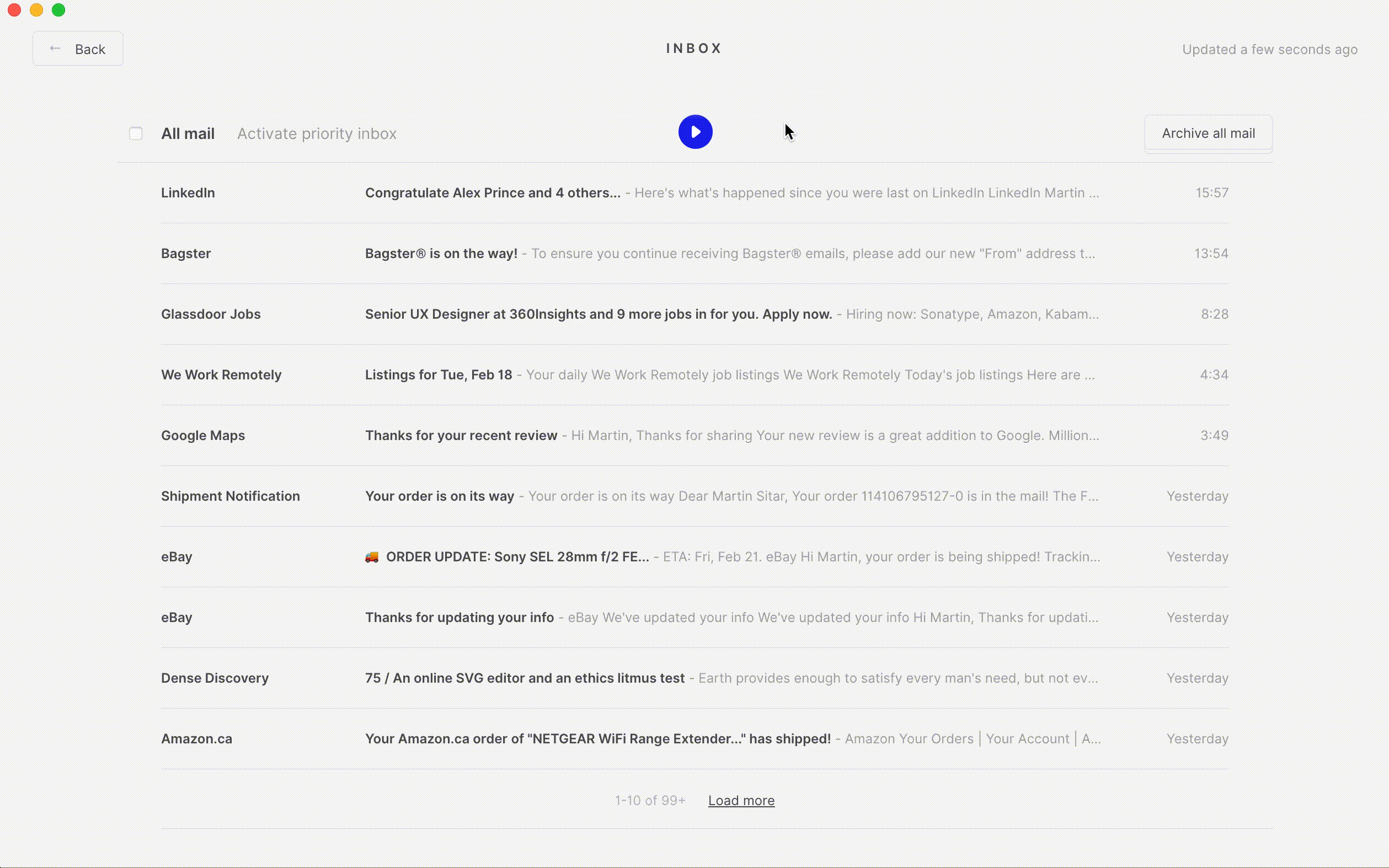
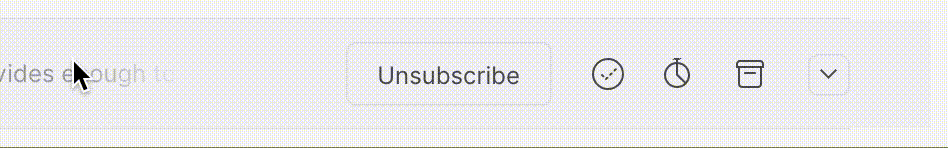
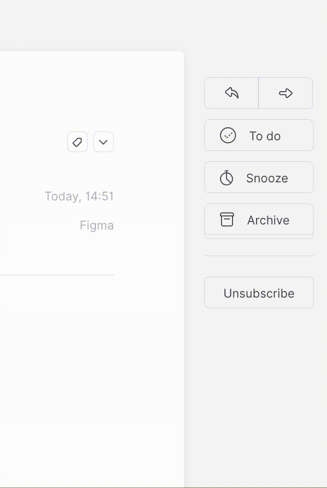
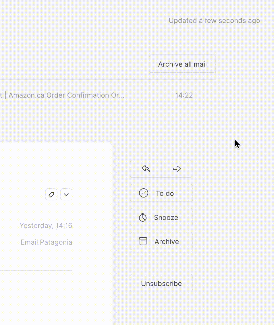
You can sort emails in your inbox using bulk actions or by making your way through the list one by one. Focus mode is a dedicated view where you individually review and categorize each item, progressing towards or staying at inbox zero. It’s a way to churn through batches of items in your inbox in short focused sessions. Tempo even hints to let you know when it’s time to pause and pick up the rest later. Actions are kept to the essentials, you can quick reply and quick forward, mark as to do, snooze, archive, or delete an item. For newsletters there is also a very clear unsubscribe button. The placement of actions to the right of the email feels natural and is consistent across the experience. I especially like how the one click unsubscribe button is subtly differentiated from the rest yet follows the same pattern and isn’t unnecessarily over stated.
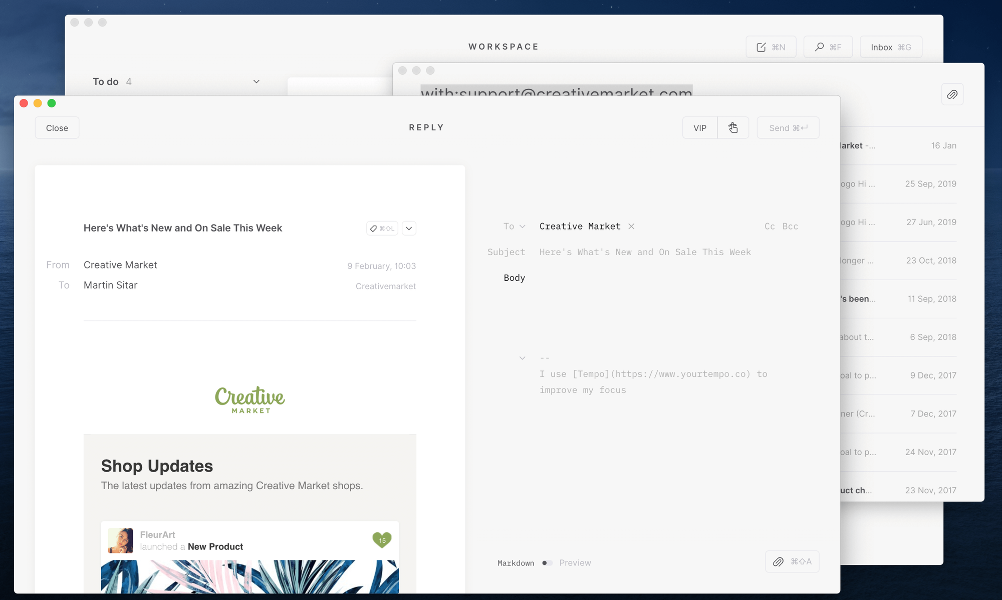
Compose
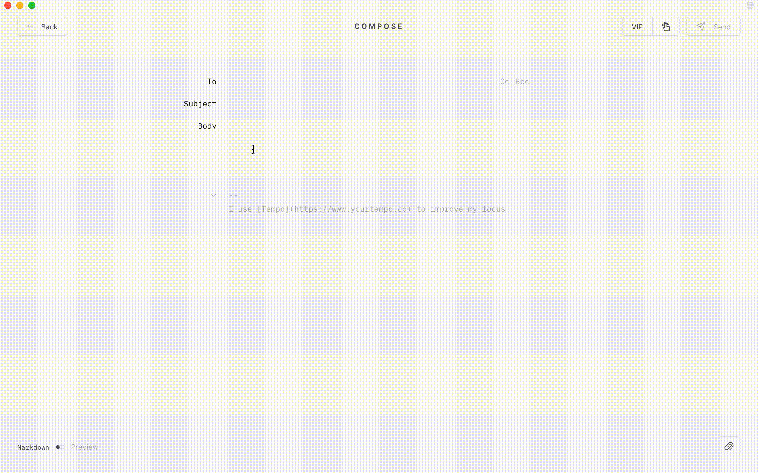
When was the last time you thought about the experience of composing an email? Admittedly it’s not something I’ve given a ton of thought, I always thought it was fine. Composing an email in Tempo was one of those moments when it instantly became clear how every other email client I’ve used had fallen short. Here especially, it feels the interface is stripped down to only what’s needed letting you focus on the task at hand, in this case writing. It supports mark-up, and there is a slick preview feature allowing you to see the rendered output. Once you actually start writing though, every piece of non-essential UI smoothly fades away and you just focus on writing. This is the kind of attention to detail that evokes a smile.
Quick Actions
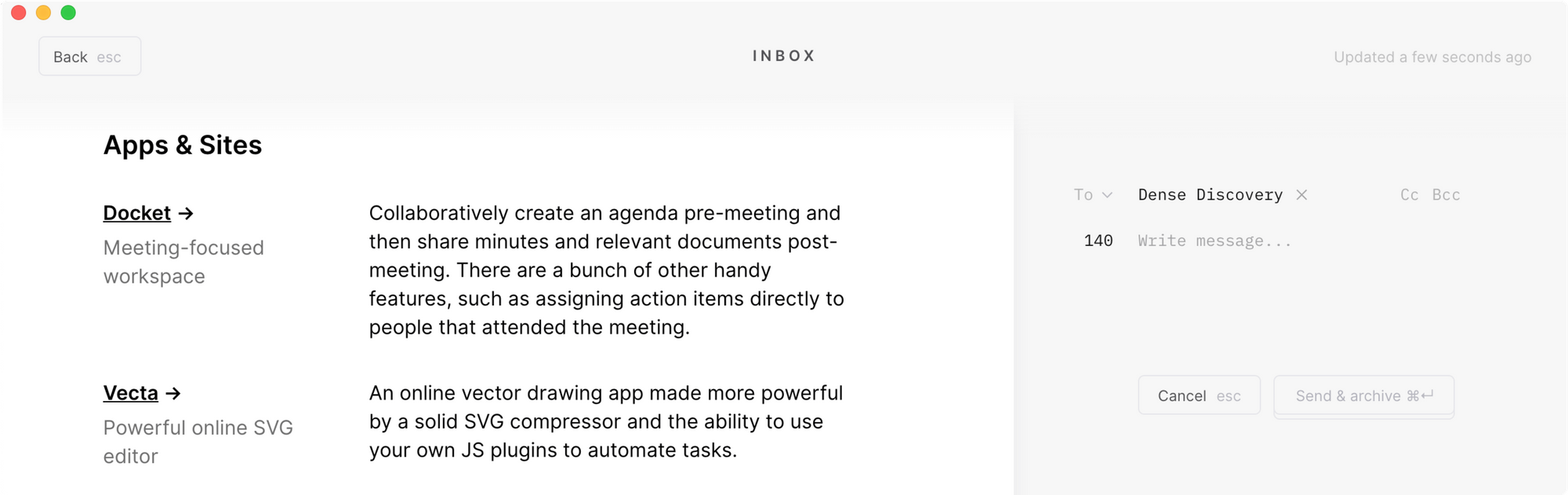
Quick reply and quick forward are neat ways to perform these tasks right within the context of your inbox. The design of this component, 140 character limit and snappy transition just lend themselves perfectly to the task.
I find the interaction after hitting send a little jarring. The first time I sent an email I wasn’t quite sure anything actually happened, or where to look for confirmation. To be fair, there is a nicely worded message at the top that even lets you cancel sending, but it’s so subtle I really had to look for it. After using the app for a few days I learned to look up there, or top right for status messages. Perhaps there is an opportunity to increase the prominence of the important ones?
Labels
I have personally wrestled between the aesthetic of using icons vs. the clarity of text on buttons in past projects. Kudos to Tempo for striking what seems like a perfect balance. Every single button has a label, either visible or on hover to clearly communicate its job. It’s not super common to see this done so gracefully, and is a huge win for clarity and usability. There are a few tricky spots where space is limited but through some clever interactions they’ve maintained this pattern.
Alternate Actions + Short Cuts
There are (at least) two keyboard actions that reveal additional functionality. Holding down command displays the keyboard shortcuts for pretty much all of the buttons on a page. I love that this is done without having to look up a help document or an FAQ page. The icons slide away to make room, and shortcuts appear within each button.
Another example of prioritizing the essential and cutting excess is physically hiding some less common actions behind their counterparts, delete behind archivefor example. Holding down the option key smoothly swaps the buttons and you can perform the alternate action.
Search
So much is done so well in Tempo, but for me one area fell a little short. The search experience and subsequent flows don’t feel quite as smooth as the rest of the app. Search opens in a pop-up window which is a little jarring and quite a departure from the full page transitions of other features. Your focus shifts to interacting with items within this window and certain actions like replying to email open in another pop-up window. With each of the other features having their own pages within the main view, I kind of I expected search to work in a similar way.
Tempo is an incredibly well designed product. It’s currently free while in Beta so give it a shot to explore and experience the interactions first hand.
Thanks for reading.